
 |
Custom Resolute Baroness WIP...
Really need some advice on this one. I've got an extra Resolute Baroness so I decided to make her a bit more screen accurate. The problem is, with the pictures I've found of her, it's hard to determine colours and what to part of her clothing they should be applied.
She's got her body suit in light grey, her boots, gloves and chest armour in black, her corset in dark grey and her..uh..codpiece? in silver. Here's a good picture of her: 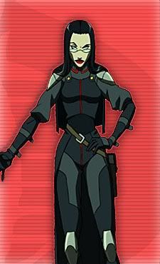 Now, I've seen pictures of her with and without the Cobra insignia on her chest, but that's not really a factor here. I'm just having a hard time matching clothing parts betwixt the figure and the above picture. For example, her mid-rif is a dark colour, but it doesn't look like a corset like the figure is wearing, it actually looks more like part of her body suit, but it's a different colour than her upper arms and upper chest. The animated Baroness also has shoulder pads the figure lacks, again, though, they ain't there, and I ain't gonna worry about it. Her chest armor matches her...well, I'll just call them her "briefs," but on the figure this matches the colour of her corset above the silver detail, but a different colour below. OK, so here's my painted version (mind you, this is just the first coat of paint): 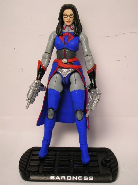 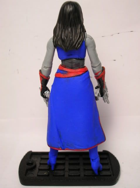 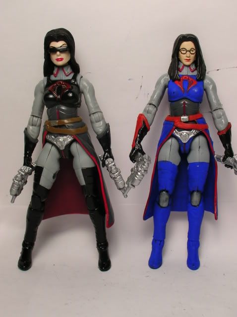 I think I have too many colours. Maybe her corset needs to match either the blue of her chest armour or the light grey of her body suit. I'm wondering about her gloves too. They have the only black on the figure, would they look better if they were blue? Or should I paint her boots black again and keep the gloves black? I want to keep some blue on her so she's closer to screen accurate and closer to Destro's colours. I like the red trim as well, but I may ditch it so it's one less colour, and would the Cobra insignia be out of place if left red or would it look cool painted black? I'm pretty lousy with colours sometimes and this is one of those times. |
Baroness and Destro had matching outfits in Resolute, if you got the Destro figure you could use that as a guide for color matching.
|
Well, I'm not too concerned about the shade of blue, but more where to paint what colour.
|
Baroness
Try the midriff black, with charcol grey on forearms and outer thighs where pictured. Light grey on inner thighs. Cape charcol grey. Small red line down the chest. Go without the sigil, the other fig has one. Light gey where pictured. I think the animation cell is your best guide. But it's whatever you want so i don't know.
|
Quote:
I think you're pretty close, but you may be over thinking this. Hasbro had the paint pattern pretty close but I think the reason it irks so many people is the colors were off. Take a look at Destro next to the Baroness and then see my comments at the bottom.    Replace the black with the Navy Blue. Skirt Thing: Paint the outside Navy Blue, paint the inside Black. Paint her midriff black. If you really like painting - repaint all the light gray stuff a slightly darker gray. Try to match the navy blue to match Destro and you'll be more screen accurate than Hasbro. I think the way she comes from the factory, all Black and light gray was a poor choice. The high contrast looks bad and doesn't fit with her Resolute look. The choice of bodies was a compromise. I'm sure they couldn't justify molding an entirely new figure. They instead used an existing mold that worked for the baroness and added accessories. I actually wonder if the first 25th Baroness sculpt wouldn't have been a better choice. This version has better boobs though. ;) |
| All times are GMT -7. The time now is 12:52 PM. |
Powered by: vBulletin Version 3.0.6
Copyright ©2000 - 2024, Jelsoft Enterprises Ltd.